
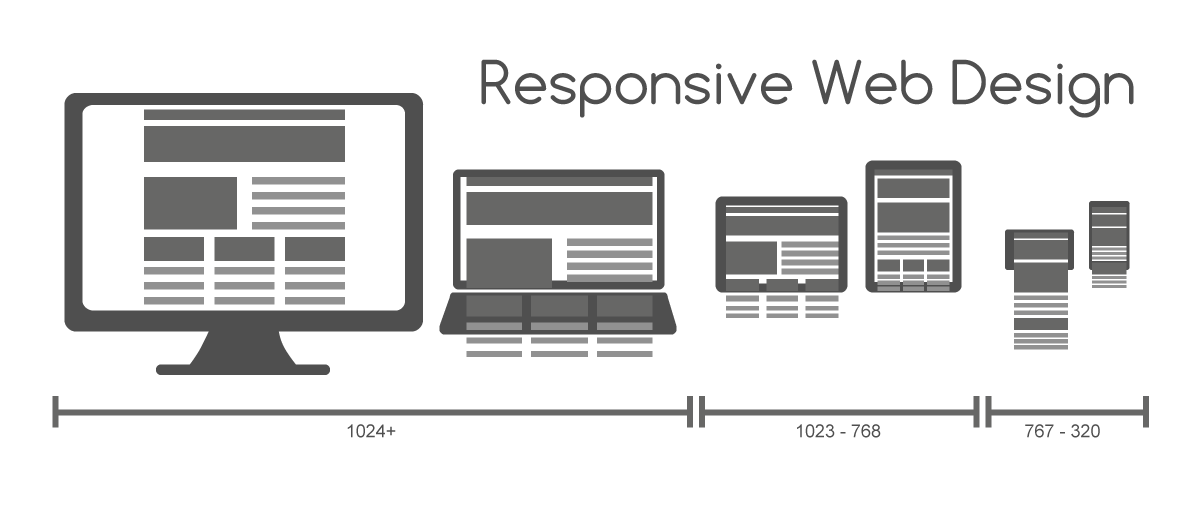
Did you know that internet users access websites from their mobile phones as much as from computers and tablets combined? Many web design companies offer websites for your company, but how many will make sure your website works for all of your site’s visitors? With a site designed by Cross City Creations, you will have a responsive site that does just that. You will rest easy knowing that your site has the flexibility demanded by the modern web community, and your visitors will experience a site designed just for them.
How Users Browse the Web
One thing to remember is that visitors tend to ask “Is this the right place for me to be looking?” as they browse the web. When you have a website that is designed for computer monitors and looks outdated, the modern user struggles to find what they need. When it takes more than a few seconds to find the information they want, they are likely to “bounce” (look at your first page for a few seconds, and then just leave). When a website is user-friendly and designed for all screen sizes, that information can be found right away, and they are more likely to stay on your website–or even to call you right away!
Why Responsive Design Is Important
Imagine that you were a mechanic with a new responsive website. Why would this be helpful? A customer’s car breaks down on the side of the road. Chances are that they will not use a laptop or tablet to search for a mechanic. They will use a cell phone! If your website is designed for optimal usability for any screen size, it will be easy for them to find and do business with you. The easier you make it for a person to buy from you, the more likely they are to do it!
Contact us below for a free consultation to get started!